A deep study on CSS Units
When you start learning about CSS you will come across a lot of basic CSS units. There are many CSS unit notations but commonly many developers use px (pixels) as default . Its OK to use px but to develop efficiently you need to know where to use which unit. Here we go through various such units and where they can be used effectively.
In CSS there are two types of length unit.
- Absolute length units
- Relative length units
Absolute length units
The absolute length units are fixed and length expressed in any of these will appear as exactly that size. These units can be used for print output but it wont suit for media output devices, as all devices do not have the same size.
| Unit | Name | Equivalent to | Usage |
|---|---|---|---|
| cm | Centimeters | 1cm = 96px/2.54 | Can be used for Print outputs |
| mm | Millimeters | 1mm = 1/10th of 1cm | Can be used for Print outputs |
| Q | Quarter-millimeters | 1Q = 1/40th of 1cm | Can be used for Print outputs |
| in | Inches | 1in = 2.54cm = 96px | Can be used for Print outputs |
| pc | Picas | 1pc = 1/6th of 1in | Can be used for Print outputs |
| pt | Points | 1pt = 1/72th of 1in | Can be used for Print outputs |
| px | Pixels | 1px = 1/96th of 1in | Commonly used everywhere |
px (pixels)
Lets talk about the most commonly used CSS unit px. When we say pixels we will automatically relate it with the device screen pixels. The sad part is it does not relate in anyway to that. What?😱 ... Yes, This was shocking even when I heard first. Funnily, I came to know about this after a year in my web development career. So what is it?
It's actually an non-linear angular measurement. The formulæ to convert between radians and px are :
radians = arctan(px/5376) * 2 px = 5376 * tan(radians/2)
“Pixel units are relative to the resolution of the viewing device, i.e., a computer or a phone display. It is recommended that the reference pixel be the visual angle of one pixel on a device with a pixel density of 96dpi and a distance from the reader of an arm's length. For a nominal arm's length of 28 inches, the visual angle is therefore about 0.0213 degrees.”
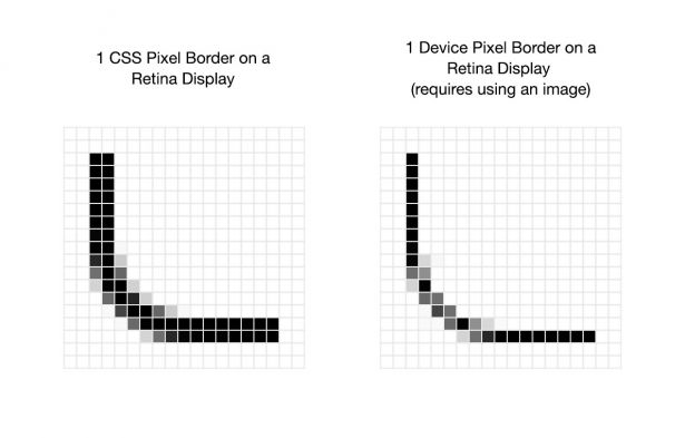
The number of device pixels that make up a CSS pixel in one direction is its Device Pixel Ratio (DPR). Every device has a different DPR and this would be defined by the device manufacture. Higher resolution devices have a higher DPR. If the device has a high DPR, you can serve it a big, high resolution image. If the device has a low DPR, you can serve it a smaller image. You wouldn’t serve a high resolution image to a device with low DPR. It’d be wasted kilobytes because the screen can’t render all the detail properly.
| name | phys.width | phys.height | CSSwidth | CSSheight | pixelratio | phys.ppi | CSSppi |
|---|---|---|---|---|---|---|---|
| Apple iPhone X | 1125 | 2436 | 375 | 812 | 3 | 458 | 288 |
CSS Pixel for iPhone X is 375 (1125 phys.width / 3 DPR )
For some devices the screen’s physical pixels don’t correspond to the actual rendered pixels, so that CSS Pixel = Device Pixels / Device Pixel Ratio formula isn’t (always) true, or in layman’s terms that formula is true if we only consider rendered pixels.
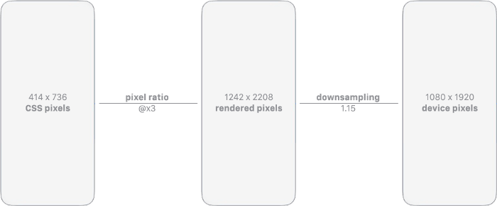
For those devices that apply a down-sampling to map the actual hardware pixels of the screen delivering assets at the optimal resolution is a bit more tricky since you don’t solely rely on the pixel ratio value. As a matter of fact, if we consider Apple’s mobile products, only the newest iPhone X has a real @×3 pixel ratio implemented, unlike all the ‘Plus’ family iPhones that have a 1.15 downsize applied.
Pixels are still a canonical measurement on the web though as they are consistently handled, many other lengths map directly to pixels, and JavaScript speaks in pixels.
The so-called absolute units (cm, mm, in, pt and pc) mean the same in CSS as everywhere else, but only if your output device has a high enough resolution. On a laser printer, 1cm should be exactly 1 centimeter. Hence other than px, all other absolute length units are not commonly used and are not preferred.
Relative Length Units
Relative length units are relative to something else, perhaps the size of the parent element's font, or the size of the viewport. The benefit of using relative units is that with some careful planning you can make it so the size of text or other elements scale relative to everything else on the page. These are most commonly used CSS units
| Unit | Relative to |
|---|---|
| em | Font size of the parent, in the case of typographical properties like font-size, and font size of the element itself, in the case of other properties like width. |
| rem | Font size of the root element. |
| ex | x-height of the element's font. |
| ch | The advance measure (width) of the glyph "0" of the element's font. |
| lh | Line height of the element. |
| vw | 1% of the viewport's width. |
| vh | 1% of the viewport's height. |
| vmin | 1% of the viewport's smaller dimension. |
| vmax | 1% of the viewport's larger dimension. |
The em , rem & px relationship
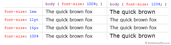
An em is a unit in the field of typography, equal to the currently specified point size.
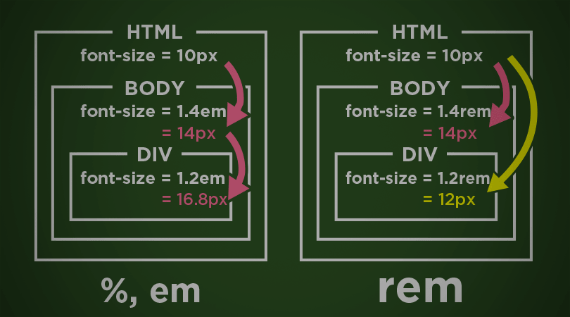
Without any CSS at all, 1em == 16px . The em value changes with the value of font-size of its parent. em units multiply upon themselves when applied to font-size, so if an element with font-size 1.1em is within an element with font-size 1.1em within yet another element with font-size 1.1em, the resulting size is 1.1 ✕ 1.1 ✕ 1.1 == 1.331rem (root em).
To make it even easier to write style rules that depend only on the default font size, CSS has since 2013 a new unit: the rem. The rem (for “root em”) is the font size of the root element of the document. Unlike the em, which may be different for each element, the rem is constant throughout the document.
Viewport Percentage Lengths
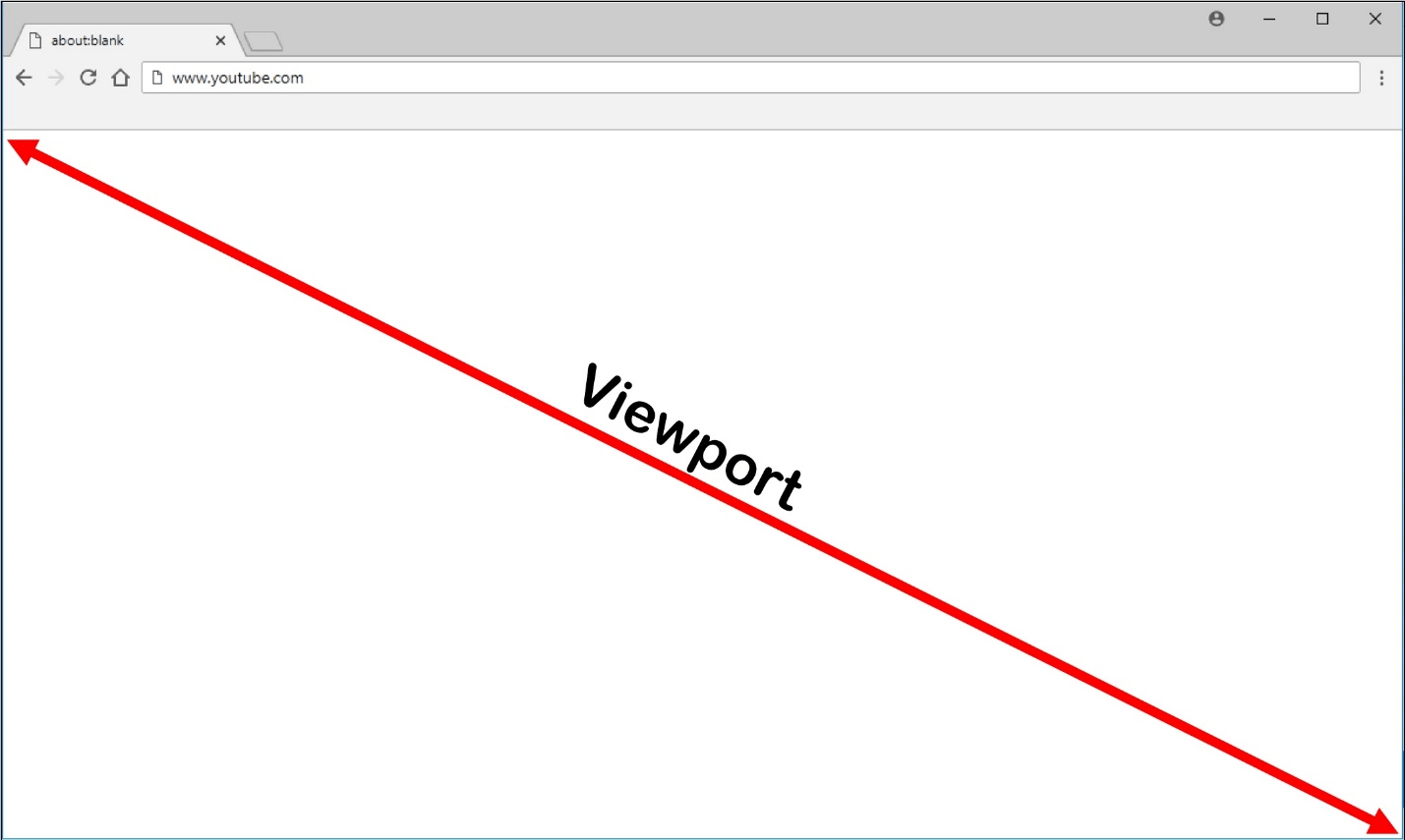
The viewport is the user's visible area of a web page (not screen or device display size). The units vw and vh are viewport width and viewport height respective to the orientation of the device. 1vw is equal to 1% of the width of the viewport. vmin and vmax takes minimum and maximum viewport sizes
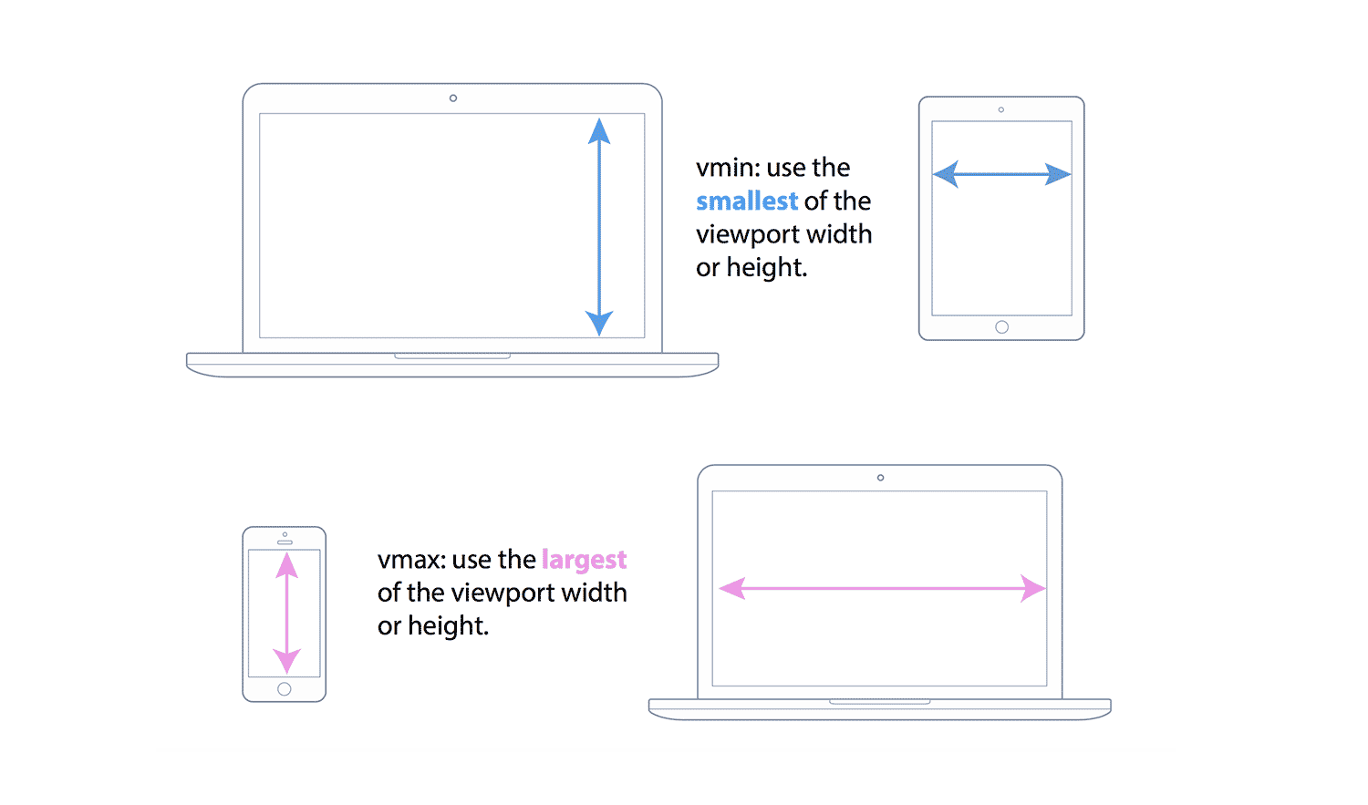
1vmin = 1vw or 1vh, whichever is smaller
1vmax = 1vw or 1vh, whichever is larger
When the height or width of the viewport is changed, they are scaled accordingly.
The most unused unit is ch known as character width. The character width of the “0” (zero) character defined in the font, to be more precisely. So however wide the “0” character is in a given typeface, that’s the measure of one ch. This means that there is a difference between the behavior of the ch unit in monospace and proportional fonts.
For below example the width is set to width: 26ch

The ch unit comes in handy when you want the width to tightly relate to the font that you use. But note that this width per character differs when using a proportional font.
The lh line-height unit will be useful when you need to use the line-height of the word. But we do not use it, as it is not supported in any of the browsers.
So in this blog we have seen about the different units and their usages. So use these units wisely and become a pro in front-end development 😉
 Smazee
https://smazee.com/uploads/blog/A-deep-study-on-CSS-Units.png
Smazee
https://smazee.com/uploads/blog/A-deep-study-on-CSS-Units.png