CASE STUDY
Twimbit
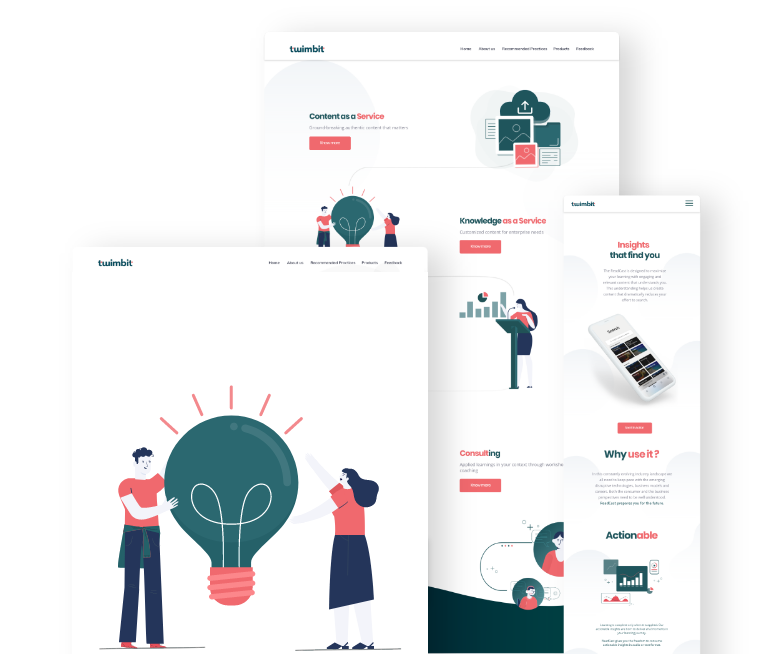
UI Designs that tell the brand's story in a visually appealing way

A design system was created for Twimbit to showcase the brand in a very friendly and techy way.
The key goal was to make the Interface Functional and Usable, so that a vriety of people can get to know the brand and their services


Colours
#2B6870
#F0696E
#FFFFFF
Typography
Poppins
Bold
Aa Bb Cc Dd Ee Ff Gg Hh Ii Jj Kk Ll Mm Nn Oo Pp Qq Rr Ss Tt Uu Vv Ww Xx Yy Zz 0123456789
Aa Bb Cc Dd Ee Ff Gg Hh Ii Jj Kk Ll Mm Nn Oo Pp Qq Rr Ss Tt Uu Vv Ww Xx Yy Zz 0123456789
Open Sans
Regular

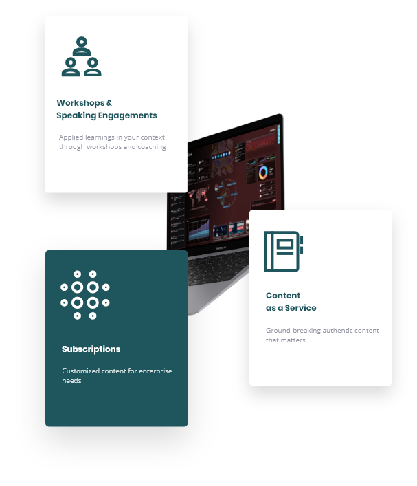
Iconography

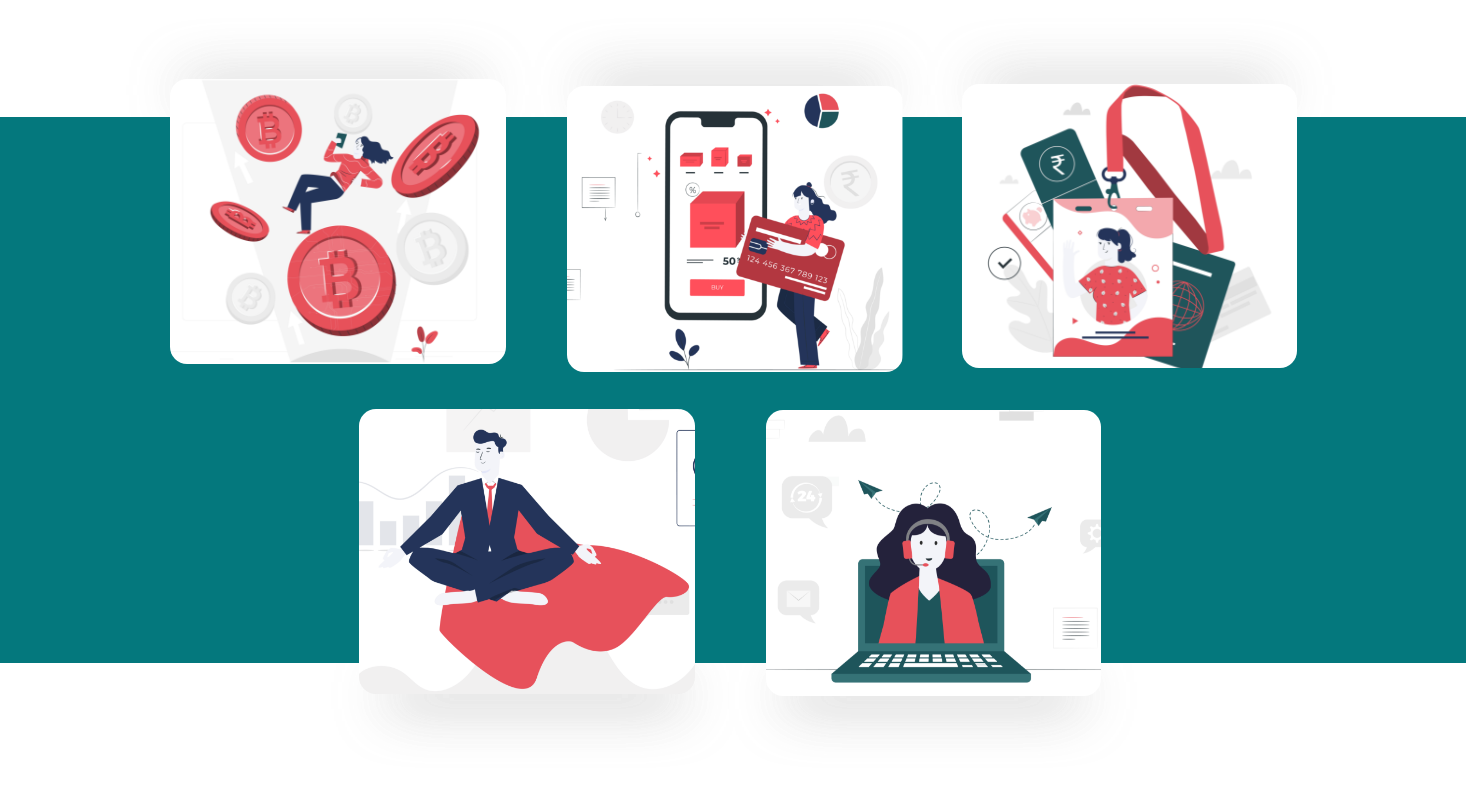
Cover Images

View next
case study
