How to Develop Advanced UI in Flutter
In this blog, we are going to discuss how to achieve complex UI in a flutter.
We have seen many beautiful UI created in Android studio and X codes but implementing those in flutter is bit difficult and complex, to be frank, we can make more beautiful and complex UI easily in a flutter. Let’s see how it is possible.
Complex Triangle
To achieve this complexity we have to learn about this triangle
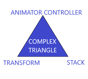
As mentioned in that figure, a complex triangle consists of 3 different components.
- Stack
- Transform
- Animation Controller
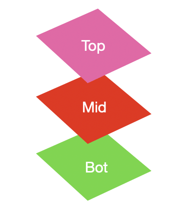
Stack
The Stack the widget allows us to put up multiple layers of widgets onto the screen.
The widget takes multiple children and orders them from bottom to top. So the first item is the bottom-most and the last is the topmost.
Stack(
  children: <Widget>[
    BottomWidget(),
    MiddleWidget(),
    TopWidget(),
  ],
),
The size of the Stack is the size of the largest member in the layer. So if the bottom layer covers the complete screen then the size of the Stack is the complete screen.
Each member in the stack needs to be positioned or aligned, or else it ends up in the top left corner by default.
As an example, let’s take three containers of shrinking size:
Stack(
  children: <Widget>[
    // Max Size
    Container(
      color: Colors.*green*,
    ),
    Container(
      color: Colors.*blue*,
      height: 300.0,
      width: 300.0,
    ),
    Container(
      color: Colors.*pink*,
      height: 150.0,
      width: 150.0,
    )
  ],
),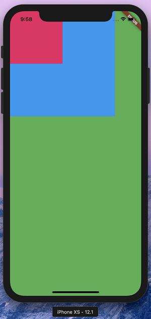
If you notice, the containers which are smaller have a lot more area to go to and hence default to top left. To change this, you can align or position your widget using the Align or Positioned widget.
An Align widget usually takes widget to extreme positions. So for example, if we enter top-right, we need to add extra padding to keep it neat and tidy. A Positioned widget combines these two things and lets us keep one Positioned widget instead of an Align and a Padding. We will see how in a while.
We’ll alter our example to use Align and Positioned. Let’s simply wrap our containers in an Align and then a Positioned widget.
Note: Positioned has to be a child of a Stack. There cannot be another widget in between the stack and the widget.
Transform
A Transform widget “transforms” (i.e. changes the shape, size, position and orientation) its child widget before painting it.
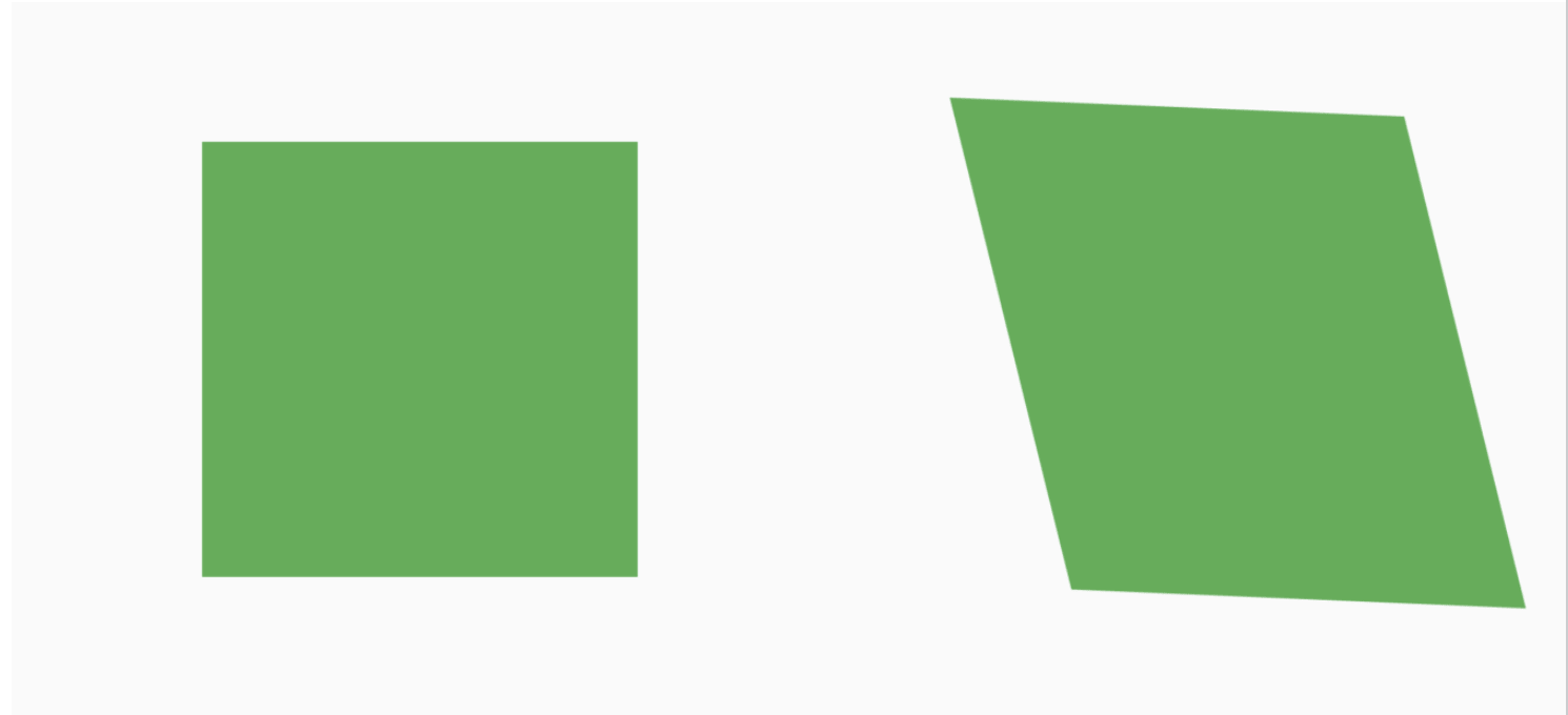
Distorting the shape of the container using Transform
This is extremely useful for custom shapes and many different kinds of animations in Flutter. This can be used to transform any widget and distort it to any shape we like or move it around as well.
Let’s start with the types of Transform widgets.
Exploring the types of Transform widget
The Transform widget gives us a few constructors to help simplify the creation of transformations. Common operations such as scaling, rotation or translation are all provided via constructors.
The types of Transform widgets are:
- Transform (default constructor)
- Transform.rotate
- Transform.scale
- Transform.translate
Animation Controller:
Animations (using code) are one of the things I’m not very fond of in Flutter code. It is setup and controlled in three parts.
- AnimationController: This manages the “Animation”. It produces a new value for every frame that is rendered, keeps track of the animation state, and exposes functionality to play (forward), reverse or stop an animation.
- Animation / Tween: This defines the begin and end values along with how to move from the beginning to end through a curve. This object will notify the controller through the Value Listenable protocol whenever the value it holds has changed.
- Ticker: A ticker is a class that listens to frame Callback and calls a tick function that passes the elapsed duration between the current frame and the last frame to the ticker listener. In our case the controller.
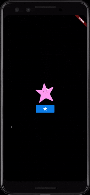
Lets start coding:
@override
Widget build(BuildContext context) {
    return Column(
        mainAxisAlignment: MainAxisAlignment.center,
        children: <Widget>[
        AnimatedContainer(
            width: _bigger ? 100 : 500,
            child: Image.asset('assets/star.png'),
            duration: Duration(seconds: 1),
        ),,
        RaisedButton(
            onPressed: () => setState(() {
            _bigger = !_bigger;
            }),
            child: Icon(Icons.star),
        ),
        ],
    );
}
And the output looks like:
Example:
If you are good enough on these 3 things, then you can make any complex UI very easily.
Let us see the following example of making the complex UI using these 3 widgets.
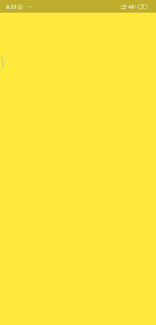
To achieve this let us consider the home screen as a yellow screen and drawer screen as a blue screen. Let’s go through the following steps:
-
The blue screen is placed behind the yellow screen.
 class CustomdrawerState extends State{

 @override
 Widget build(BuildContext context) {
     var drawer=Container(color: Colors.blue,);
     var child=Container(color:Colors.yellow);
     return Stack(children: <Widget>[
         drawer,
         child
     ],
 );
 }
 }
In this step, we had implemented a stack for placing the two-screen one above the other.
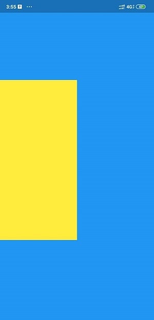
-
The yellow element getting smaller.
 class CustomdrawerState extends State{

 @override
 Widget build(BuildContext context) {
 var drawer=Container(color: Colors.blue,);
 var child=Container(color:Colors.yellow);
 return Stack(
   children: <Widget>[
     drawer,
         Transform(
             transform: Matrix4.identity()..scale(0.5),
             alignment: Alignment.centerLeft,
             child: child,
         )
     ],
 );
 }

 }
In this step, we implement a transform widget to scale it to half.
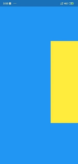
-
The yellow element is moving to the right.
 class CustomdrawerState extends State{
 final double maxSlides=255.0;

 @override
 Widget build(BuildContext context) {
 var drawer=Container(color: Colors.blue,);
 var child=Container(color:Colors.yellow);
 return Stack(
   children: <Widget>[
     drawer,
     Transform(
       transform: Matrix4.identity()
       ..translate(maxSlides)
       ..scale(0.5),
       alignment: Alignment.centerLeft,
       child: child,
    )
 ],
 );
 }

 }
We had moved the widget to the right side of the screen using the translate keyword inside transform.
- Make the transition smooth.
This is quite an important and tricky step where all animation and other elements take place.
a. Include SingleTickerProviderStateMixin in the class and initiate the animation controller.
class CustomdrawerState extends State with SingleTickerProviderStateMixin{
AnimationController animationController;
@override
void initState() {
    super.initState();
    animationController=AnimationController(vsync: this,
    duration: Duration(milliseconds: 250));
}
b. Make a toggle function to change the direction whenever it got dismissed.
void toggle()=> animationController.isDismissed?animationController.forward():animationController.reverse();c. Create an animated builder.
return GestureDetector(
onTap: toggle,
child: AnimatedBuilder(animation: animationController,
builder: (context,_){
  double slide=maxSlides*animationController.value;
  double scale=1- (animationController.value*0.3);
  return Stack(
    children: <Widget>[
      drawer,
      Transform(
         transform: Matrix4.identity()
         ..translate(slide)
         ..scale(scale),
         alignment: Alignment.centerLeft,
         child: child,
      )
   ],
);
}),
);
Whenever tapping the yellow screen, the animator gets forwarded and reversed.
Reference: YouTube
 Smazee
https://smazee.com/uploads/blog/How-to-Develop-Advanced-UI-in-Flutter.png
Smazee
https://smazee.com/uploads/blog/How-to-Develop-Advanced-UI-in-Flutter.png