What Makes a UI Design look good?
It is said that the best interfaces are invisible. This holds true as a UI designer's aim is to create a clear and understandable interfaces for the users that makes them get things done quickly and comfortably.
A good Interface is very essential because it is the entry point of customers for online businesses, this is where trust can be created between customers and businesses. There are lot of principles and plenty of strategy that goes into creating interfaces that facilitate user goals. In this blog we shall go through the very fundamentals.
Less is More
A screen will be more powerful and useful if more is said with less. Every element of the design must support the intent of the message being conveyed to the users. Eliminate all superfluous and redundant elements. One major thing that prevents users from finding what they want is Cluttered design, de-clutter your designs as much as possible. While using aesthetic elements be very careful, doing it too much will cause unwanted clutter.
Look out: 8fit Encourages Health Goals Through Minimal Design And A Guidance-Based Layout
Logic
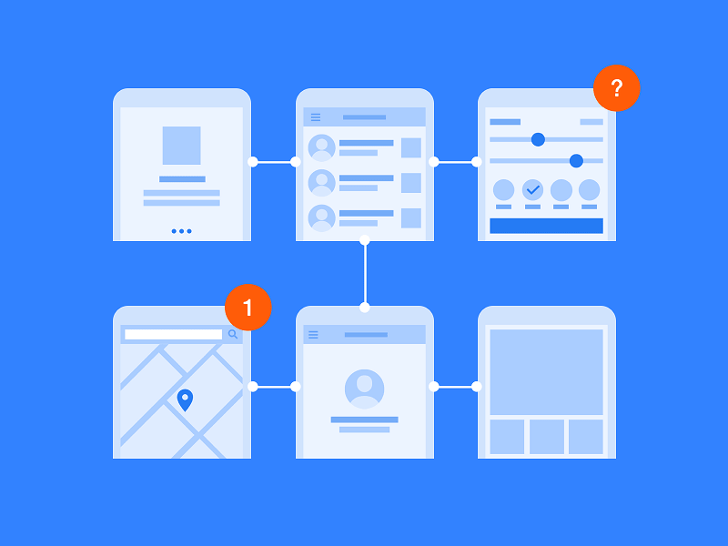
It is very vital to design important page elements in consistent locations on all screens. A logical view of the site and its pages will enable people to quickly find what they are looking for. The aim is to understand the user flow and how users perform particular tasks and the design should easily facilitate those tasks.
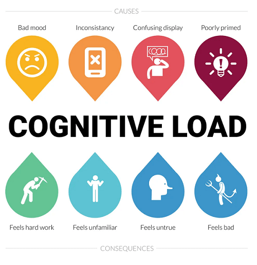
When a screen is designed with good logic, it reduces the cognitive load for the users, a layout that matches a person’s expectations enables prediction of where to find things and how to do things. Illogical and inconsistent structures lead only to poor user experience and frustration.
Consistency
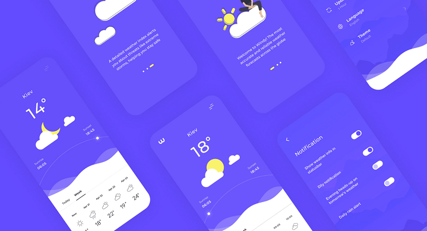
Weather App by Maria Syrovatka
Consistency creates familiarity, and familiar interfaces are naturally more usable. Consistency is essential to reducing the cognitive load of your interface. When your design is consistent, every interaction feels smooth and friction less. Consistency can be applied to many UI elements such as fonts, colors, icons, imagery etc, It is always best to create a design system for projects that involve a lot of screens. This also makes sure that the layout is consistent across all devices while designing.
Self-explanatory
Whenever you are designing a UI page the how you present the content ie UX copy is key. Content on each screen or page should be self-explanatory, giving a clear indication of what web-page or app screen it belongs to and where it fits within the structure of the information space. Present the proper information, and arrange it, so users always know where they are. Always remember to keep all pages or screens easily accessible by planning out navigation flows, the goal is to take the user where they want to be in the simplest way possible.
Scannable
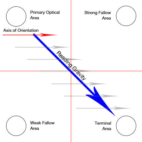
The Gutenberg diagram describes a general pattern the eyes move through when looking at evenly distributed, homogeneous information.
Having plenty of white space is essential to improve readability of the screens, allow the design to breathe. This helps people to easily scan a page and select relevant and useful information. To foster scannability, include headings that accurately reflect the content of text. Also create short paragraphs and use simple bulleted lists. Avoid elements that don't fit in as they create unwanted visual noise, for eg : do not use too much links or overly fancy icons, fonts etc.
Well balanced
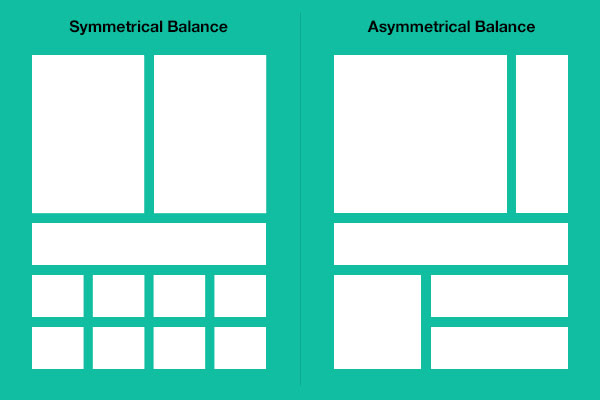
Always strike a proper balance between textual information, graphics and navigation links. To achieve a sense of unity and harmony in your designs balance is very essential. A page’s elements must balance, interact with, and support each other. While designing the concept of visual weight comes in, based on how you arrange the composition of the screen the design may look heavy, experiment with color,size and contrast to distribute the visual weight evenly.
Studies show people prefer textual content, so do not clutter up the page with too many graphics, particularly at the top. A large top graphic may push important textual content and navigation links off the bottom of the page where they cannot be seen. Always make sure text is visible first so people can start reading right away. Conversely, densely packed text will be difficult to read. Long and detailed textual information can usually be relegated to secondary pages.
In conclusion, a UI designer needs to master a lot of skills like Interaction principles, Wire framing, prototyping, branding, colour theory and more. The above mentioned basics are tried and trusted by many, which can be a good base to build your designs around.